.jpg) Corri Taylor and Milo Schield
Corri Taylor and Milo Schield
QL in the Media Contest Archive
In 2011, SIGMAA-QL ran its inaugural contest to find the best examples of the use and abuse of quantiative literacy in the media. The SIGMAA awarded prizes to contestants in the following categories.
- Best use of QL in written or spoken media:
Larry Lesser of Univ Texas at El Paso for "The Mathemusician teaches the lottery-playing public with song" - Best use of QL in a graphic or video media:
Semra Kilic-Bahi of Colby Sawyer College got the most votes for "Hans Rosling's 200 Countries, 200 Years, 4 Minutes - The Joy of Stats." Semra is an officer of the SIGMAA & so ineligible, so the award goes to:
Aaron Montgomery of Central Washington University for "Obama's 2012 Budget Proposal: How $3.7 Trillion is Spent." - Best Learning Moment:
Marc Isaacson of Augsburg College for "Presidential Gender Preference?" - Best use of QL taken from the media in teaching:
Larry Lesser of Univ Texas at El Paso for "Predicting Rain."
2011 Contest Entries
Multiplicities in Comparing the Effectiveness of Online and Live Lectures
Entrant: David Lane
Category: Best learning moment
Link to Original: Danger of subgroup analyses
Description: An article in the New York Times reported on research that found live lectures are better than online lectures. Although there was no overall effect, analyses of subgroups did show a difference for a few groups. Unfortunately, the NYT article did not report the number of subgroup analyses that may have been done and therefore did not give the reader the information necessary to properly assess the validity of the findings. Follow the link to a handout explaining the problem in detail.
What Calculus-like "Areas" analysis tells us about Global Warming
Entrant: Harel Barzilai
Category: Best use of QL in spoken or written media
Link to Original: Drastic Action on Climate Change
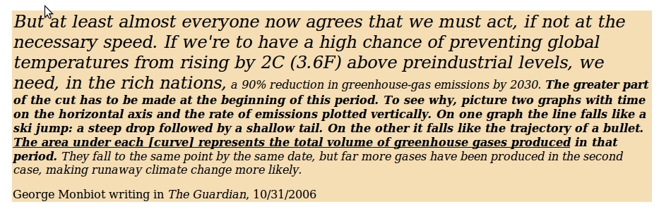
Description: George Monbiot's mathematically sophisticated analysis on global warming notes that areas under graphs of "rate" functions represent total cumulative amounts; here: greenhouse gases. Do we need to cut emissions by p% within N years or by q% within M years? Monbiot points out that even if we settle on what percent cut (over today's emissions) and in how many years the deadline is, a critical question is the shape (concavity) of the curve! Above image contains the remarkable paragraph.
Category: Best use of QL in spoken or written media
Link to Original: Drastic Action on Climate Change
Description: George Monbiot's mathematically sophisticated analysis on global warming notes that areas under graphs of "rate" functions represent total cumulative amounts; here: greenhouse gases. Do we need to cut emissions by p% within N years or by q% within M years? Monbiot points out that even if we settle on what percent cut (over today's emissions) and in how many years the deadline is, a critical question is the shape (concavity) of the curve! Above image contains the remarkable paragraph.
Republicans and the Filibuster
Entrant: Tom Pfaff
Category: Best use of QL in video or graphics media
Link to Original: Filibuster Time Series
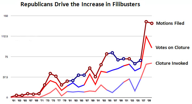
Description: Kevin Drum of Mother Jones offers a reader's plot of the frequency of filibusters in the US over the past 50 years.
Category: Best use of QL in video or graphics media
Link to Original: Filibuster Time Series
Description: Kevin Drum of Mother Jones offers a reader's plot of the frequency of filibusters in the US over the past 50 years.
Why is there such a thing as the McRib Sandwich?
Entrant: Tom Pfaff
Category: Best use of QL in video or graphics media
Link to Original: McRibs and Price of Pork
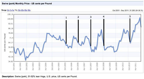
Description: Kevin Drum of Mother Jones picks up Willy Staley's explanation for why McDonalds periodically reintroduces the McRib sandwich.
Category: Best use of QL in video or graphics media
Link to Original: McRibs and Price of Pork
Description: Kevin Drum of Mother Jones picks up Willy Staley's explanation for why McDonalds periodically reintroduces the McRib sandwich.
World of (Class) Warfare
Entrant: Tom Pfaff
Category: Best use of QL in video or graphics media
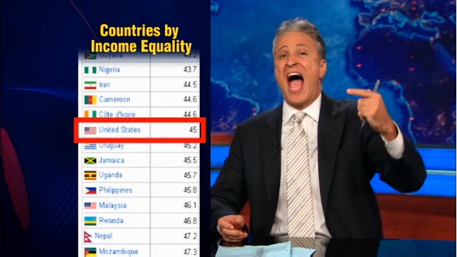
Link to Original: Jon Stewart uses Gini index
Description: On the Daily Show for August 18, Jon Stewart uses the Gini index to question Marco Rubio's claim that the US is not like a third-world country.
Category: Best use of QL in video or graphics media
Link to Original: Jon Stewart uses Gini index
Description: On the Daily Show for August 18, Jon Stewart uses the Gini index to question Marco Rubio's claim that the US is not like a third-world country.
The Mathemusician teaches the lottery-playing public with song
Entrant: Larry Lesser
Category: Best use of QL in written or spoken media
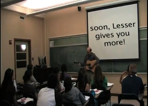
Link to Original: The Gambler redux
Description: This link is to a YouTube video of entrant Larry Lesser singing his own version of the country song "The Gambler," rewritten to educate potential lottery players.
Category: Best use of QL in written or spoken media
Link to Original: The Gambler redux
Description: This link is to a YouTube video of entrant Larry Lesser singing his own version of the country song "The Gambler," rewritten to educate potential lottery players.
CNNMoney Apple 2.0 blog post on "tiny" survey
Entrant: David Lane
Category: Best use of QL in teaching
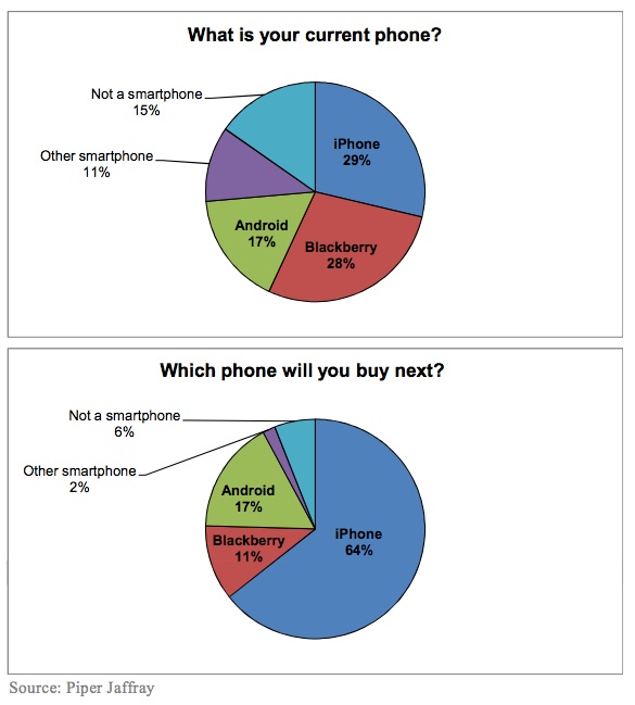
Link to Original: iPhone Conclusions justified?
Description: This link to David Lane's class handout includes the link to the original blog post, and outlines his use of the news piece to teach about confidence intervals for survey data.
Category: Best use of QL in teaching
Link to Original: iPhone Conclusions justified?
Description: This link to David Lane's class handout includes the link to the original blog post, and outlines his use of the news piece to teach about confidence intervals for survey data.
Money
Entrant: Chawne Kimber
Category: Best graphic/video
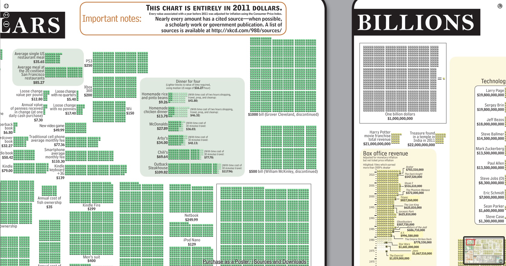
Link to Original: Poster showing money in 2011
Description: This graphic compares monetary quantities in 2011 US dollars at various sizes: ones, thousands, millions, billions, and trillions.
Category: Best graphic/video
Link to Original: Poster showing money in 2011
Description: This graphic compares monetary quantities in 2011 US dollars at various sizes: ones, thousands, millions, billions, and trillions.
Presidential Gender Preference?
Entrant: Marc Isaacson
Category: Best learning moment
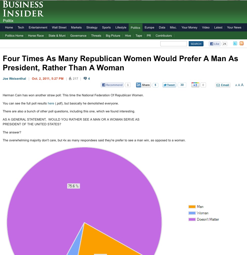
Link to Original: Four Times As Many Republican Women Would Prefer A Man As President, Rather Than A Woman
Description: Reporting the results of a survey conducted by the National Federation of Republican Women, Business Insider uses a headline that highlights the disparity within the small minority of respondents who indicate a preference in candidates by gender, but displays a pie chart showing that the "overwhelming majority don't care" what the gender of the President is.
Category: Best learning moment
Link to Original: Four Times As Many Republican Women Would Prefer A Man As President, Rather Than A Woman
Description: Reporting the results of a survey conducted by the National Federation of Republican Women, Business Insider uses a headline that highlights the disparity within the small minority of respondents who indicate a preference in candidates by gender, but displays a pie chart showing that the "overwhelming majority don't care" what the gender of the President is.
Academically Adrift Data Don't Support Claim
Entrant: Bianca Falbo
Category: Best use of QL in written or spoken media
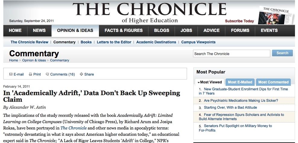
Link to Original: In 'Academically Adrift,' Data Don't Back Up Sweeping Claim
Description: In an Op-Ed piece from the Chronicle for Higher Education, Alexander Astin questions the use of statistical inference supporting the most widely publicized claim in Richard Arum's and Josipa Roksa's controversial new book.
Category: Best use of QL in written or spoken media
Link to Original: In 'Academically Adrift,' Data Don't Back Up Sweeping Claim
Description: In an Op-Ed piece from the Chronicle for Higher Education, Alexander Astin questions the use of statistical inference supporting the most widely publicized claim in Richard Arum's and Josipa Roksa's controversial new book.
Radiation Dose Chart
Entrant: Maura Mast
Category: Best graphic/video
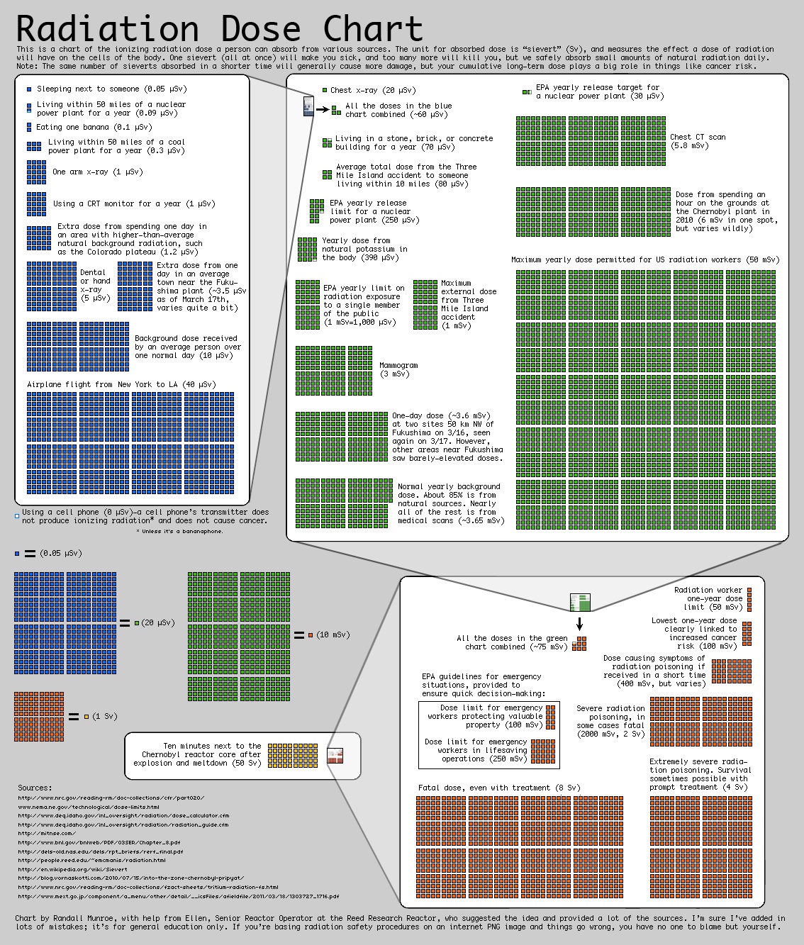
Link to Original: Radiation Chart
Description: This chart shows the relative magnitude of radiation doses from a variety of sources, particularly timely as a response to the Fukushima accident. While an aside to the webcomic xkcd might not seem like a general media outlet, but the chart has been picked up by blogs at media outlets.Here are links to The Guardian and New York Times blogs mentioning the chart, which is in the public domain.
Category: Best graphic/video
Link to Original: Radiation Chart
Description: This chart shows the relative magnitude of radiation doses from a variety of sources, particularly timely as a response to the Fukushima accident. While an aside to the webcomic xkcd might not seem like a general media outlet, but the chart has been picked up by blogs at media outlets.Here are links to The Guardian and New York Times blogs mentioning the chart, which is in the public domain.
(Im)perfect Storm
Entrant: Larry Lesser
Category: Best use of QL in teaching
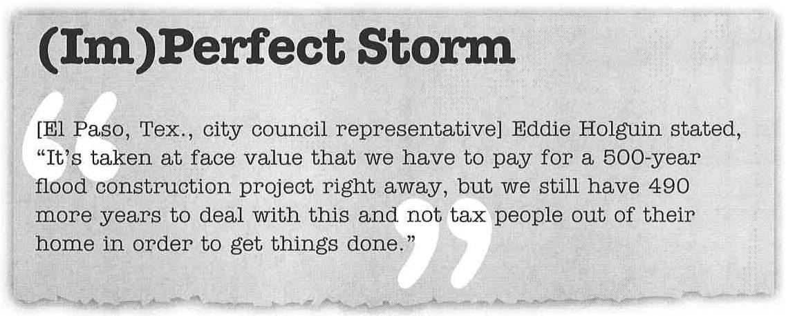
Link to Original: Probability of a 500-year flood
Description: A sequence of exercises built around a short clip from the El Paso Times and the National Weather Service's definition of a 100-year flood. Reprinted with permission from Mathematics Teacher, copyright 2009 by the National Council of Teachers of Mathematics. All rights reserved.
Category: Best use of QL in teaching
Link to Original: Probability of a 500-year flood
Description: A sequence of exercises built around a short clip from the El Paso Times and the National Weather Service's definition of a 100-year flood. Reprinted with permission from Mathematics Teacher, copyright 2009 by the National Council of Teachers of Mathematics. All rights reserved.
Predicting Rain
Entrant: Larry Lesser
Category: Best use of QL in teaching
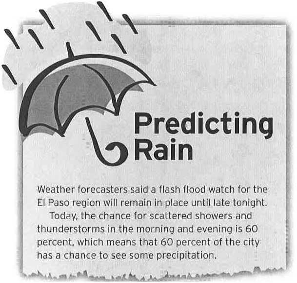
Link to Original: Probability of Precipitation
Description: A brief sequence of exercises built around a short clip from the El Paso Times and the National Weather Service's definition of POP. Reprinted with permission from Mathematics Teacher, copyright 2007 by the National Council of Teachers of Mathematics. All rights reserved.
Category: Best use of QL in teaching
Link to Original: Probability of Precipitation
Description: A brief sequence of exercises built around a short clip from the El Paso Times and the National Weather Service's definition of POP. Reprinted with permission from Mathematics Teacher, copyright 2007 by the National Council of Teachers of Mathematics. All rights reserved.
Obama's 2012 Budget Proposal: How $3.7 Trillion is Spent
Entrant: Aaron Montgomery
Category: Best graphic/video
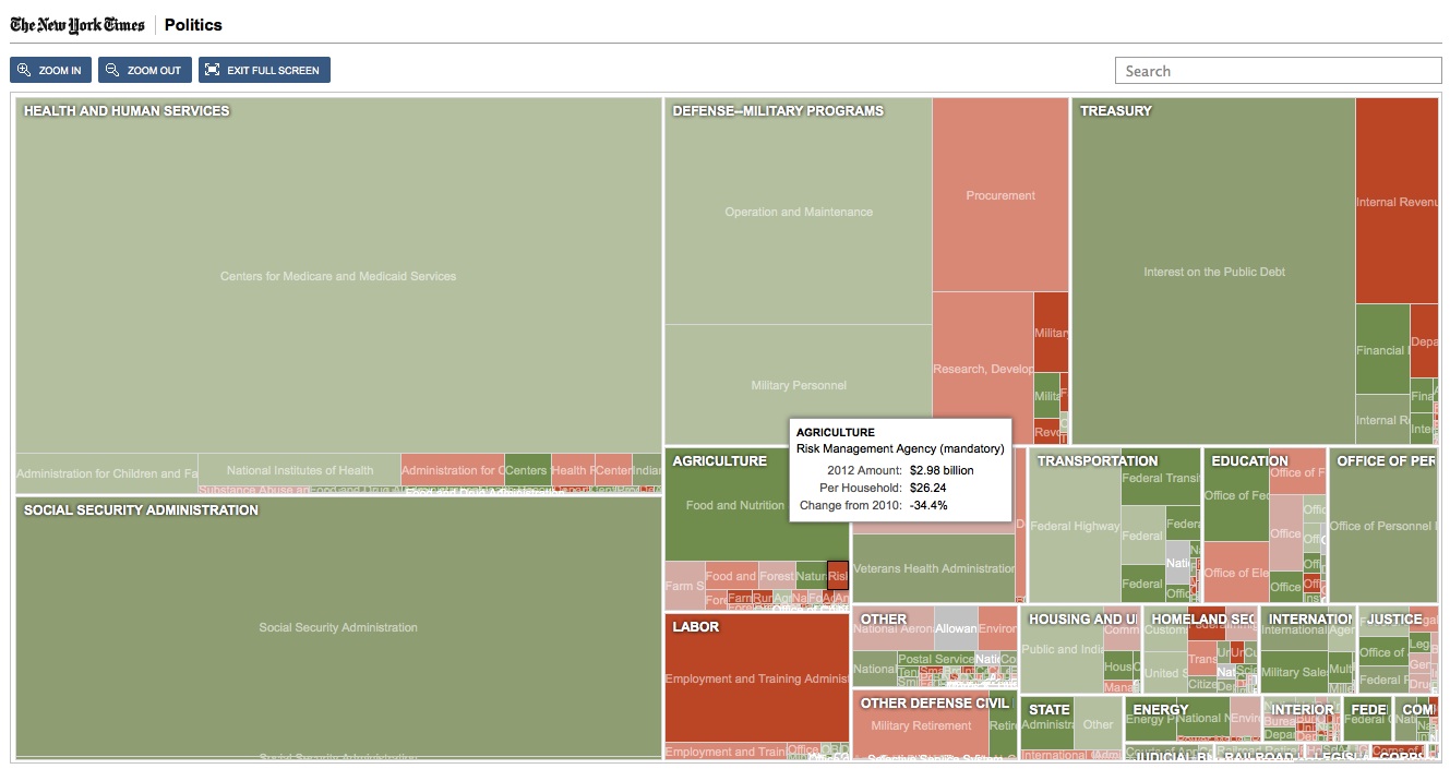
Link to Original: Proposed Federal Budget
Description: Take a guided tour of the proposed 2012 Federal budget courtesy of the New York Times.
Category: Best graphic/video
Link to Original: Proposed Federal Budget
Description: Take a guided tour of the proposed 2012 Federal budget courtesy of the New York Times.
GOOD.is | Interactive Transparency: America's Energy, Where It's From and How It's Used
Entrant: Eric Gaze
Category: Best graphic/video
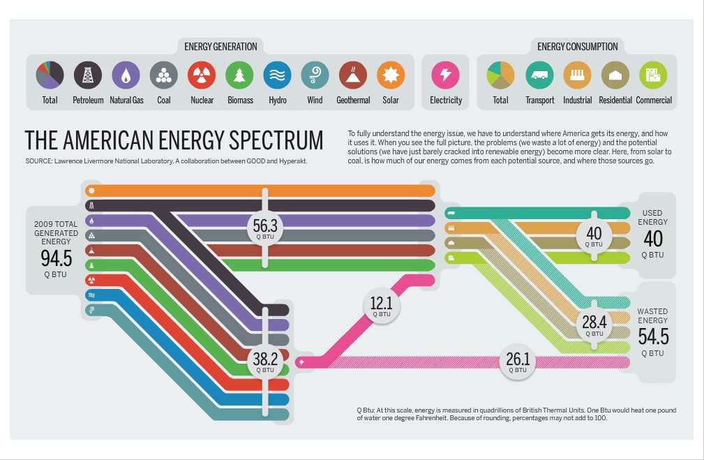
Link to Original: GOOD.is Energy
Description: This Flash animation offers a compact but informative summary of (1) the sources of energy in the American economy, (2) the uses that energy is put to, and (3) how much is wasted.
Category: Best graphic/video
Link to Original: GOOD.is Energy
Description: This Flash animation offers a compact but informative summary of (1) the sources of energy in the American economy, (2) the uses that energy is put to, and (3) how much is wasted.
Hans Rosling's 200 Countries, 200 Years, 4 Minutes - The Joy of Stats
Entrant: Semra Kilic-Bahi
Category: Best graphic/video
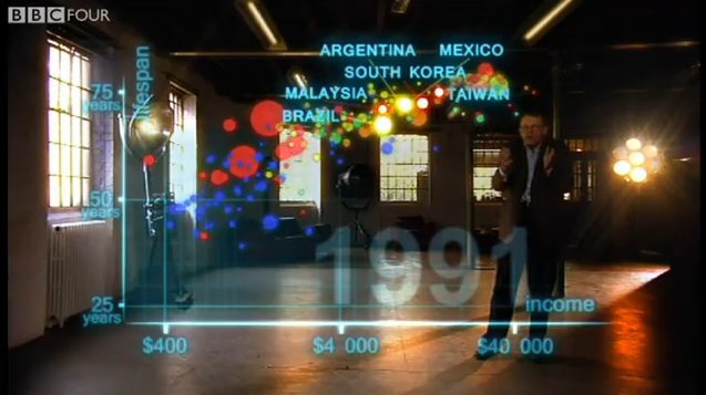
Link to Original: Hans Rosling on BBC
Description: Hans Rosling's renowned presentations have a new archetype in this BBC 4 presentation.
Category: Best graphic/video
Link to Original: Hans Rosling on BBC
Description: Hans Rosling's renowned presentations have a new archetype in this BBC 4 presentation.
QL in the Media Contest Poll
Here are the results of the voting on which the awards were based. There were 63 voters and 16 entries.
This poll was not scientific, and no one should mistake it for anything other than a way to have some fun publicizing examples of QL that members of SIGMAA-QL individually think are worthy of note. If you are here viewing the entries and the votes they generated, we have succeeded. Thanks for your interest.

